Senthil V.
Founder of ecoHiny
Running into Cansu as our chief design/branding resource is one of the best decisions for our company. Great quality work and designs that truly resonate with our customers. Highly recommend her!
ecoHiny
Fresh and playful brand identity for bamboo eco-friendly products, combining sustainability with bold design.
Brand Identity for Sustainable Bathroom Products

02
Sector:
Household & Personal Care
03
Services:
Creative Direction, Brand Identity & Packaging
Make a small change daily, make a big change forever.
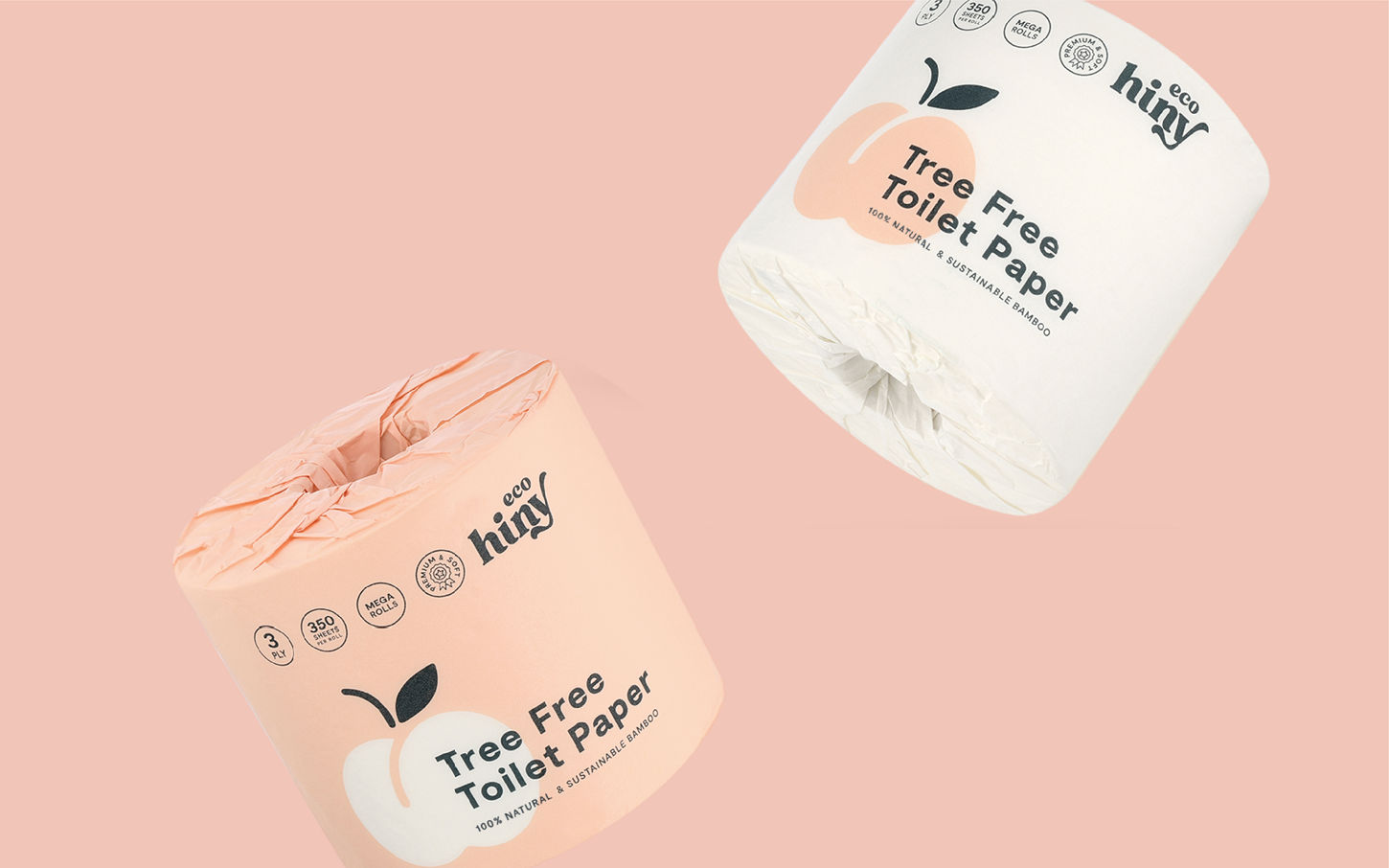
Made from bamboo, ecoHiny makes sustainability affordable without sacrificing a premium experience. 100% organic bamboo, FSC certified and soft as a feather. We created the brand direction inspired by the quirky name of the brand. The brand symbol is chosen as a peach, while the colors represent the fun, natural and the soft nature of the product. The packaging is fully recyclable and the product itself is septic safe, BPA free, and elemental chlorine free, promoting eco-friendliness.
Project Overview

Can a toilet paper brand be cool and fun?
During the research phase we realized that all bamboo toilet paper brands use the same tone of bright green. Our aim was to differentiate the brand from others on the market by using a unique color palette. The choice of colors creates a fun and playful personality for the brand. Deep blueish green hue, paired with peach, also conveys a sense of eco-friendliness and sustainability.
As a typeface, a modern sans-serif font was chosen to convey a sense of simplicity and approachability. The font is legible and easy to read, making it ideal for product packaging and web design. The product name is displayed prominently and in large font size on the shipping box packaging, as the product will be displayed on online platforms such as Amazon.
Process


