Blog - Why Most Logos Don’t Matter (And What Actually Does)
A standalone logo will never launch a high-end brand, justify a premium price point, or command shelf authority. In modern brand strategy, a logo is simply a memory trigger. It is not the foundation of enterprise value. True brand equity is built through strategic brand architecture, cohesive visual systems, and tactile execution across every customer touchpoint.
When launching a luxury alcobev line, an elite real estate development, or a high-growth consumer brand, fixating solely on the mark misunderstands how consumers evaluate value.
Here is why most logos fail to drive commercial growth, and what strategic visual identity design actually requires.
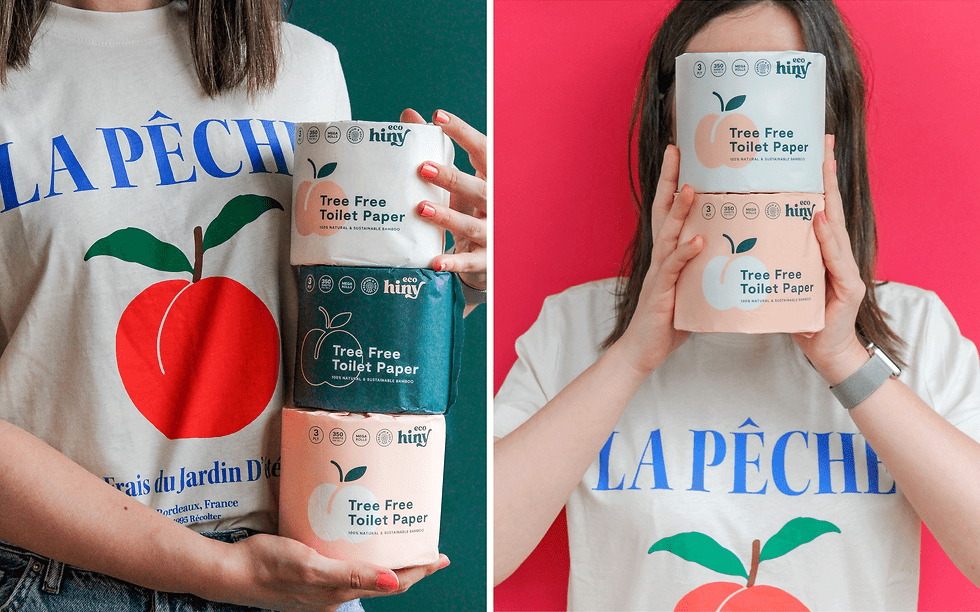
To illustrate this principle, consider the visual progression from our identity work for Ecohiny shown in the images below. When presented in complete isolation, even a refined logo appears as a simple, flat mark on a screen. It is only when we expand into full brand architecture, surrounding the symbol with intentional typography, tactile packaging, and contextual touchpoints, that the mark acquires depth, credibility, and real market authority. The logo does not create the world. The world gives power to the logo.

1. A Logo is an Empty Vessel Without Brand Architecture
A mark holds zero intrinsic financial or emotional weight on day one. Whether evaluating heritage houses or contemporary luxury brands, the symbol is respected because of the story, visual world, and craftsmanship built around it.
Without a clearly defined brand architecture and market positioning, a logo is just an expensive vector file. Equity accumulates in the narrative, strategic differentiation, and market execution that the mark represents.

2. Pricing Power Lives in the Visual System
Luxury brands do not command premium margins because of a symbol. They achieve pricing power through a rigorous visual system that communicates authority before a single word is read:
Typographic Architecture: Bespoke type choices and grid structures that convey intellectual restraint and prestige.
Color Discipline: Distinct color palettes engineered to dominate digital feeds and physical retail spaces.
Spatial Rules: Generous white space and intentional composition that signal confidence.
When these elements work together, they establish immediate category leadership. The logo merely signs off on the statement your visual system has already made.

3. Tactile Packaging Architecture Creates Shelf Authority
In physical product sectors, particularly spirits, wine, beauty, and specialty goods, the unboxing experience and bottle silhouette do far more heavy lifting than the mark itself.
Perceived value is felt through tactile materiality:
Premium paper stocks, custom embossing, and metallic foil weights.
Custom bottle detailing, closures, and structural ergonomics.
Production-ready dielines engineered for flawless manufacturing.
A consumer feels the quality of a product in their hands before they ever analyze the logo.

4. Sharp Positioning Beats Generic Authenticity
Modern consumers spot generic branding instantly. A visual identity system must clearly communicate where a brand sits in the competitive landscape:
What white space in the market does this brand occupy?
Why is its price tier justified?
Who is this designed for, and who is it intentionally excluding?
If your visual direction does not reflect a sharp strategic thesis, even the most polished mark will fall flat in a crowded market.
5. Systemic Cohesion Builds Commercial Trust
Disjointed brand touchpoints erode enterprise value faster than a weak logo ever could. A brand that presents a sleek logo on social media but delivers generic packaging, a broken website experience, or inconsistent marketing collateral breaks consumer trust instantly.
Consistency across spatial, physical, and digital environments builds perceived reliability. Investors, high-net-worth buyers, and global distributors evaluate systematic excellence across the entire ecosystem.
6. Adaptable Visual Systems Outlast Trends
Designing for long-term growth requires building a visual identity engineered for evolution. As a business expands into new SKUs, international markets, or secondary product lines, the brand architecture must accommodate scale without requiring a complete redesign.
A strategic system establishes clear rules for sub-brands, seasonal releases, and tier structures, ensuring the master brand remains recognizable anywhere in the world.
The Studio Matte Approach
Building an enduring brand is an exercise in strategic discipline, not decorative preference. While a refined mark completes a brand, the strategy, visual architecture, and tactile execution are what turn an initial venture into a high-value market asset.
At Studio Matte, our approach is strategy-led and system-first. Operating from Paris, we partner with ambitious founders, luxury distillers, and premier developers to build brand worlds from the ground up. We do not treat design as mere ornamentation. We engineer comprehensive visual identities, packaging architectures, and brand narratives designed to command shelf authority and long-term pricing power.
By taking complete creative authority from discovery through to production-ready deliverables, we ensure that every touchpoint reinforces your market position, transforming ambitious concepts into globally recognized icons.


Comments